

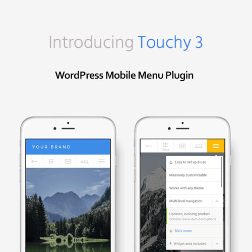
Touchy – WordPress Mobile Menu Plugin
The Ultimate Mobile Navigation Solution for WordPress
Touchy – WordPress Mobile Menu Plugin is a premium mobile navigation solution designed specifically for smartphones and tablets. Whether your WordPress site is a blog, business site, WooCommerce store, or creative portfolio, Touchy provides a fast, elegant, and highly customizable mobile menu experience that ensures your visitors can navigate your site with ease on any device.
With responsive design, smooth animations, and a powerful customization panel, Touchy makes it simple to deliver a professional, app-like mobile navigation experience that enhances usability and improves engagement.
Overview
Touchy is widely recognized as one of the best WordPress mobile menu plugins for modern websites. It is built to provide seamless performance across all screen sizes, ensuring that your site’s navigation remains user-friendly and visually appealing on mobile devices.
The plugin is easy to set up, works with any WordPress theme, and requires no coding knowledge. You can customize every element — from menu colors, typography, and icons to button placement and animations — directly from the intuitive settings panel.
Touchy isn’t just a mobile menu; it’s a complete mobile header and navigation system designed to replace or complement your theme’s default menu on smaller screens.
Key Features
1. Fully Responsive and Mobile-Optimized
Touchy is built specifically for mobile users, ensuring a perfect fit on smartphones, tablets, and other touch-enabled devices. It delivers fast, smooth, and responsive performance for a premium user experience.
2. Complete Mobile Header Solution
In addition to menus, Touchy includes a complete mobile header with optional logo placement, search functionality, and call-to-action buttons, allowing you to design a full mobile navigation bar.
3. Advanced Customization Options
Easily change colors, fonts, icons, and spacing from the WordPress admin panel. You can match your menu to your site’s branding effortlessly without editing code.
4. Touch-Friendly Design
Optimized for touch gestures, the menu is easy to open, close, and navigate with smooth transitions and intuitive controls that feel natural on mobile devices.
5. Integrated Search Functionality
Add a built-in search bar directly inside your mobile menu or header, making it easy for visitors to find content or products on your site.
6. Flexible Layout Options
Choose between vertical or horizontal layouts, adjust menu height and width, and customize button positions. You can even display or hide specific elements based on user preferences.
7. WooCommerce Compatible
Touchy seamlessly integrates with WooCommerce, allowing online stores to provide an optimized shopping experience on mobile devices with easy navigation and search.
8. High Performance and Lightweight
Touchy is optimized for speed and performance, ensuring your site loads fast and runs smoothly on all mobile devices.
9. Works with All WordPress Themes
The plugin is theme-independent and works flawlessly with any modern WordPress theme or builder, including Elementor, Divi, and WPBakery.
10. Developer Friendly
Built with clean, well-documented code, Touchy offers hooks and filters for developers who want to extend functionality or create custom integrations.
Benefits
-
Improve mobile user experience instantly with a professional menu design.
-
Reduce bounce rates by making navigation faster and more intuitive.
-
Add search and call-to-action buttons directly in your mobile header.
-
Easily match your site’s color scheme and typography.
-
Save time with a quick, code-free setup.
-
Increase mobile engagement and conversions on WooCommerce sites.
Why Choose Touchy
Unlike generic responsive menus, Touchy is designed exclusively for mobile navigation. It offers more control, flexibility, and aesthetics than most built-in theme menus, giving your visitors a native app-like browsing experience.
It’s lightweight yet powerful, making it ideal for website owners who want to improve usability without compromising speed or performance. Whether you run a blog, a corporate site, or an eCommerce store, Touchy provides an elegant, professional, and highly functional mobile interface.
Compatibility
-
Requires: WordPress 6.x or higher
-
Compatible with: Elementor, Divi, WPBakery, Gutenberg, and all modern WordPress themes
-
Supports: WooCommerce, Contact Form 7, and WPML
-
Optimized for: iOS, Android, and modern mobile browsers
SEO Keywords and Tags
Touchy, Touchy Mobile Menu Plugin, WordPress Mobile Menu, Touchy GPL, WordPress Responsive Menu Plugin, Mobile Navigation Plugin, Touchy Download, WooCommerce Mobile Menu, Touchy for WordPress, Mobile Header Plugin
Conclusion
Touchy – WordPress Mobile Menu Plugin is the perfect solution for enhancing your website’s mobile usability. With its responsive design, customization flexibility, and intuitive interface, it ensures your visitors enjoy effortless navigation on any device.
If you want to deliver a premium, app-like mobile experience and improve overall site engagement, Touchy is a must-have plugin for any modern WordPress website.
Bring mobile-first design to your WordPress site today with Touchy — the most advanced and customizable mobile menu plugin available.


Thomas A. –
Thank you for the fast update and working file.
Jace V. –
Amazing support!
Raymond Y. –
The download link arrived instantly, great service.
Maddox O. –
Fast response and delivery.